[message title=”Go to the virtual map” title_color=”#ffffff” title_bg=”#0b5394″ title_icon=”” content_color=”#ffffff” content_bg=”#ffffff” id=””]Access the virtual map here.[/message]
[message title=”Accéder à la carte (Pleine page)” title_color=”#ffffff” title_bg=”#0b5394″ title_icon=”” content_color=”#ffffff” content_bg=”#ffffff” id=””]https://carte.france-science.com.[/message]
The CORD19 Publications Dashboard is a cartographic tool for geographic and temporal visualization of all the publications relating to COVID-19, it has been developed by the Service for Science and Technology of the Embassy of France in the United States and is based on the CORD-19 database available on Kaggle and made publicly accessible by the Office for Science and Technology Policy of the White House, in collaboration with the NIH and the IAA.
The COVID19 Publication Dashboard is made of a set of figures, graphs, and cartographic windows dynamically generated according to the search parameters chosen by the user.
Filtering menu:
![]()
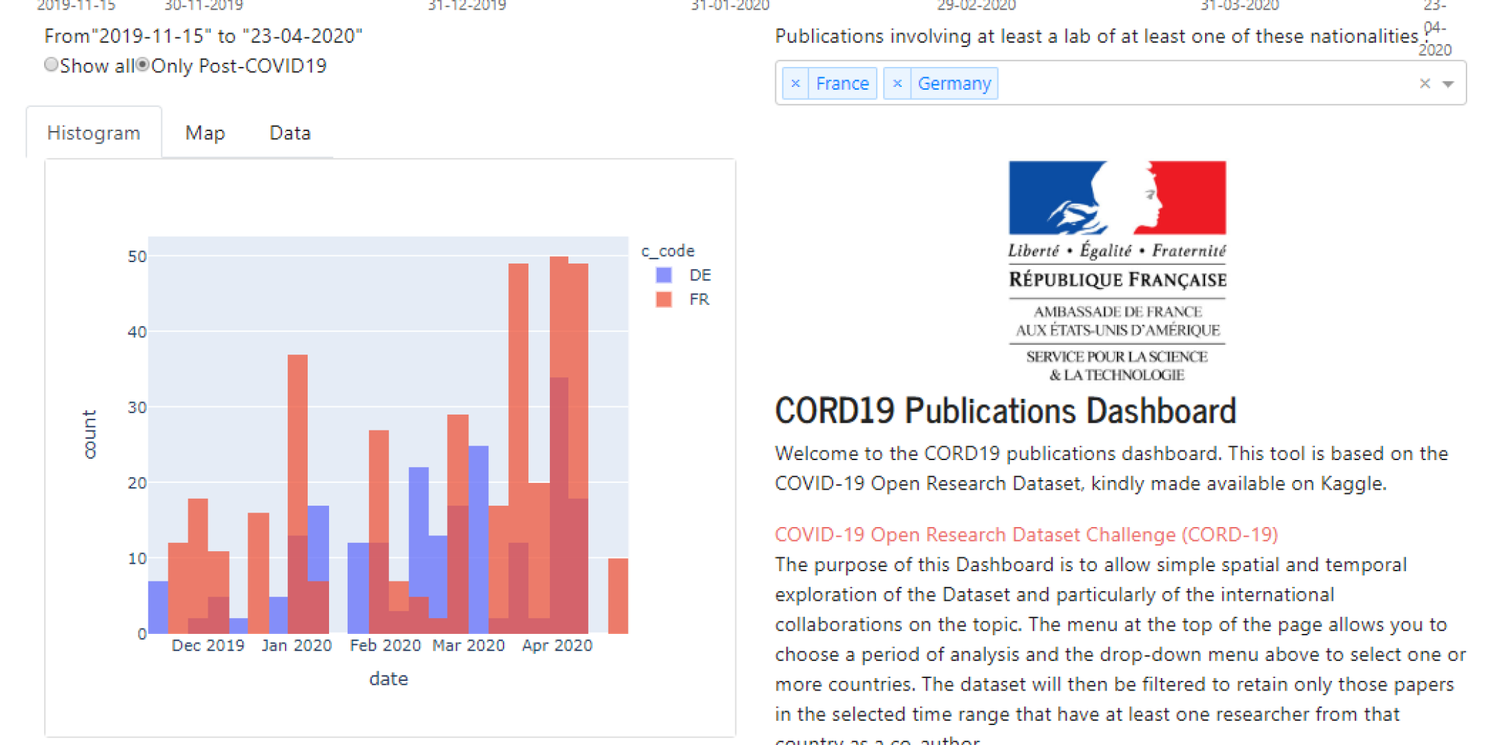
A menu, at the top of the screen, allows you to modify three search parameters to temporally or spatially filter the database:
- The “Show All / Only Post-COVID19” button allows you to limit the filter results only to articles published after November 15th, 2019, articles that a priori may be directly linked to SARS-CoV-2 and COVID- 19, or on the contrary to request the entire database, which includes articles dating back to the 60s and are more loosely related to the coronavirus.
- The blue selection bar at the top of the menu allows you to choose a specific time window for a search.
- The selection menu on the right allows you to choose the country or countries from which you wish to see publications, that is to say articles involving at least one scientist affiliated with a research organization in that country as a co-author.
Navigations tabs:

Navigation between the different pages of the application is possible with three clickable tabs, the content of which is detailed below. These pages present various graphics, maps or tables generated from the timeframe and national filters previously selected by the user.
Histogram:

The histogram shows the time distribution of publications for each country selected in the menu. A color code makes it possible to differentiate the corresponding countries.
In addition, the page contains an explanatory paragraph on how to operate the application.
Map :

The map tab allows you to explore the geographic distribution of publications as well as highlight collaborations with the country selected in the menu. The map shows the institutions around the world that have participated in publications with the selected country.
The first map to appear on the left allows you to select the country for which you want to explore all of the publications. It is possible to zoom and move the view in the window so that you can better see each country. The number appearing on the disc indicates the number of publications in which at least one author (or co-author) from this country is involved.
For example, if you select France from the country menu, the database is filtered so that only publications involving France appear. Consequently, on the map, the disc positioned on France will indicate the number of all publications involving a French author. The discs positioned on the other countries will then indicate only the number of co-publications involving at least one French author and one author from this country.
To see all of the French authors, all you have to do is click on the France disc.
On the other hand, to see American institutions involved in international collaborations with France, you will need to click on the disk appearing on the territory corresponding to the United States.
Once a disk is selected, several pieces of information appear:
– On the right of the general map a table listing all the publications filtered to date.
– A second map appears below which details all the institutions involved in the selected country (it is possible to zoom in, which is important in large cities where there may be several overlapping organizations). It is then possible to have more information on any one of them by clicking on it.
Once this click is made on a given institution, two new elements appear:
– On the right appears a representation of the network of this institution (it only presents other institutions collaborating with the country or countries selected in the menu), this network is navigable by clicking on the institutions presented and the other elements of the Dashboard will be dynamically updated to match. By making a “click & drop” on a node of this network, it is possible to modify its configuration to see the names of the nodes appear more clearly.
– Below appears the details of the co-publications between this institution and researchers from the country initially selected. This section then presents, under the map, the articles with their titles, authors, date of publication, journal, summary and link to the publication.

Data :

The “Data” tab offers a table that summarizes all the articles involving the country selected in the menu with the date, the title, the journal and a link to the article.
